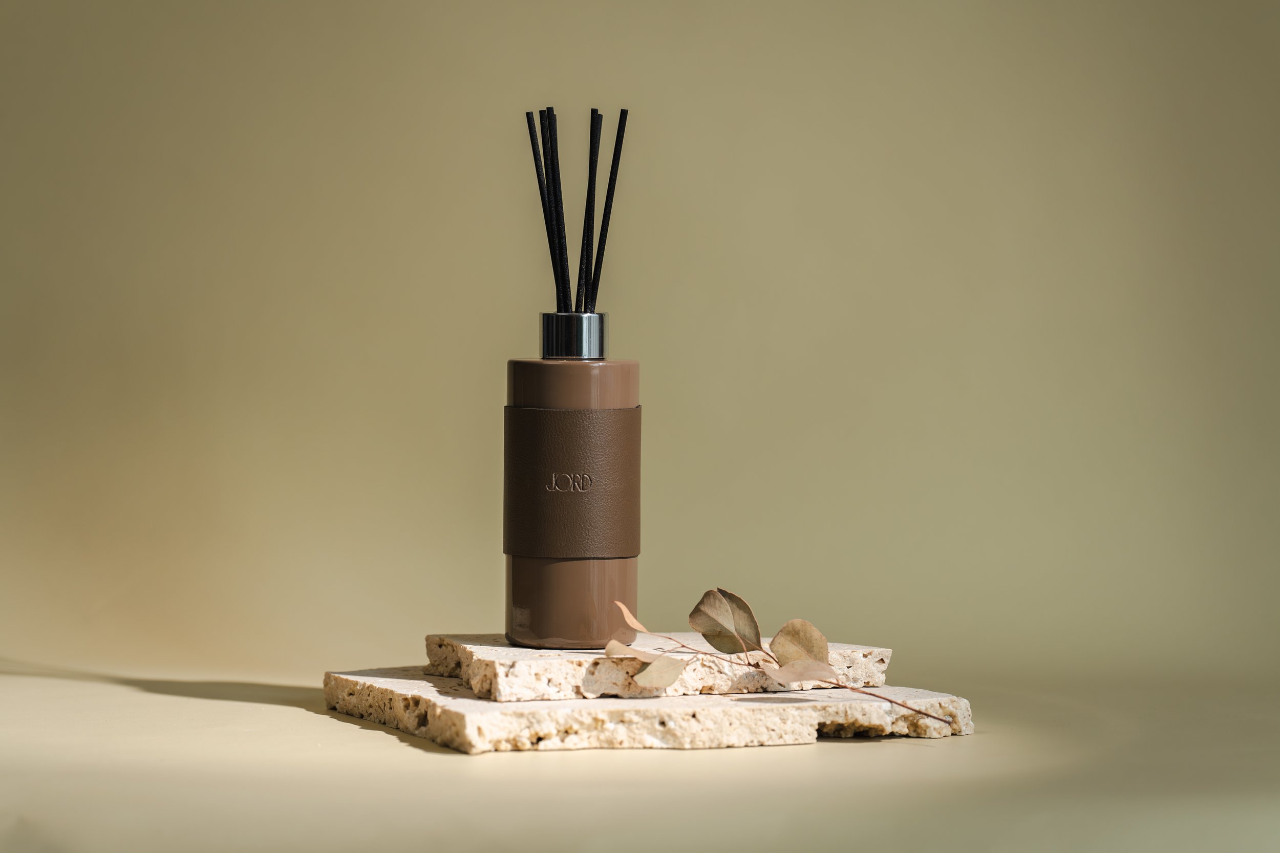
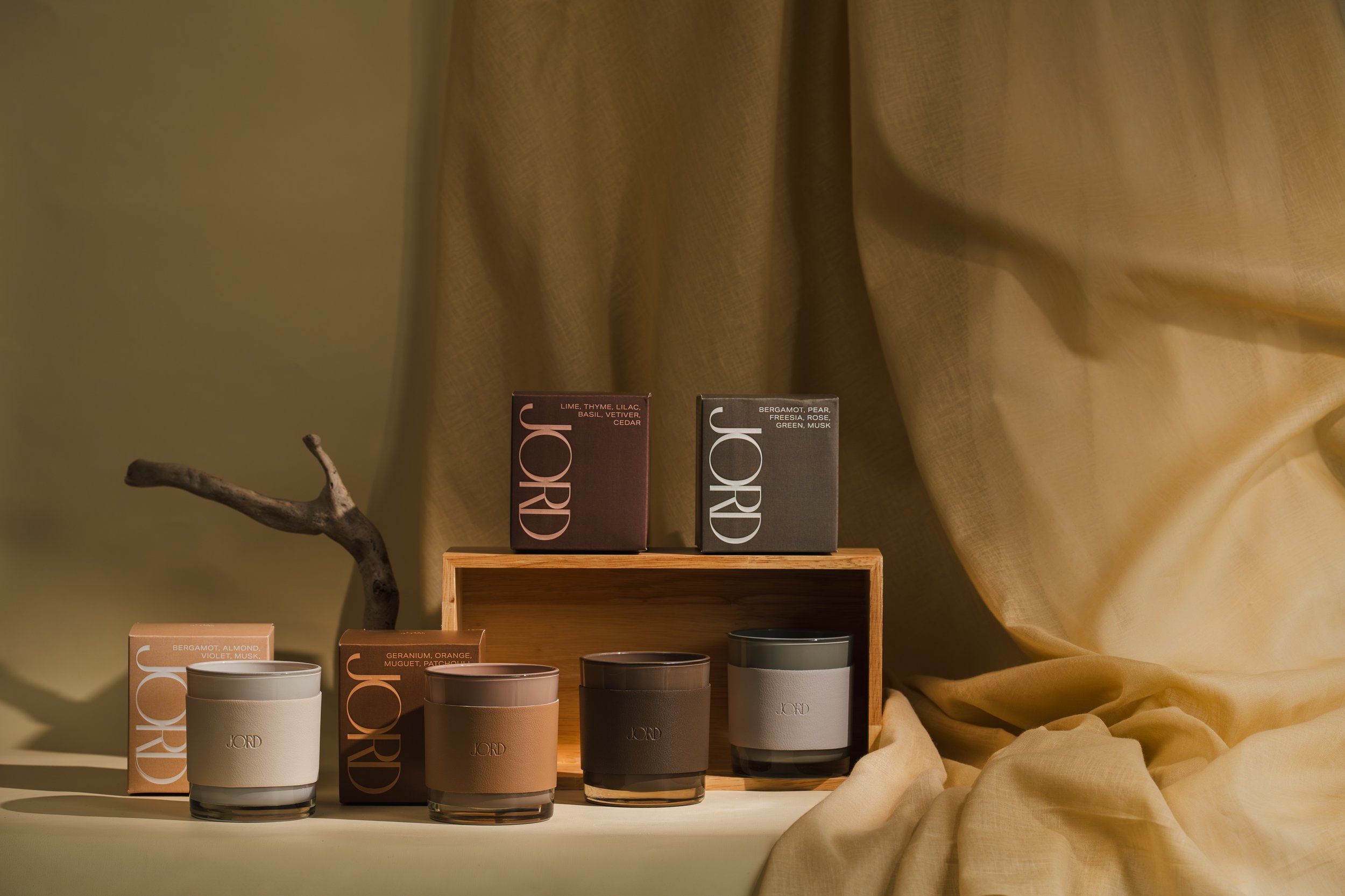
JORD, a fragrance line, aimed to create modern and sophisticated packaging for their winter collection, targeting mature consumers in Japan. The client wanted a bold aesthetic with minimal text and a cohesive look for in-store displays.
To achieve this, I emphasised large, bold typography as the focal point of the design and used a two-tone colour scheme to maintain a minimal yet striking appearance. Neutral, earthy tones were chosen to ensure unisex appeal.
The final packaging design effectively balanced modernity and sophistication, resonating with the target demographic while ensuring brand coherence on retail shelves. This version retains the essential details while being more concise.


