Housing Japan, a real estate company specialising in English-speaking services, sought to modernise its brand image while maintaining a professional and premium tone. The goal was to elevate the company's online presence and attract foreign investors and expatriates seeking luxury real estate in Japan.
Initially, the company's logo featured multiple colours ranging from blue to pink. This was refined by selecting blue as the primary colour and pairing it with a serif font, creating a more modern and minimal aesthetic. This strategic move was effective as blue conveys trust and professionalism—qualities essential in the real estate industry—while the serif font added sophistication, appealing to the luxury market segment.
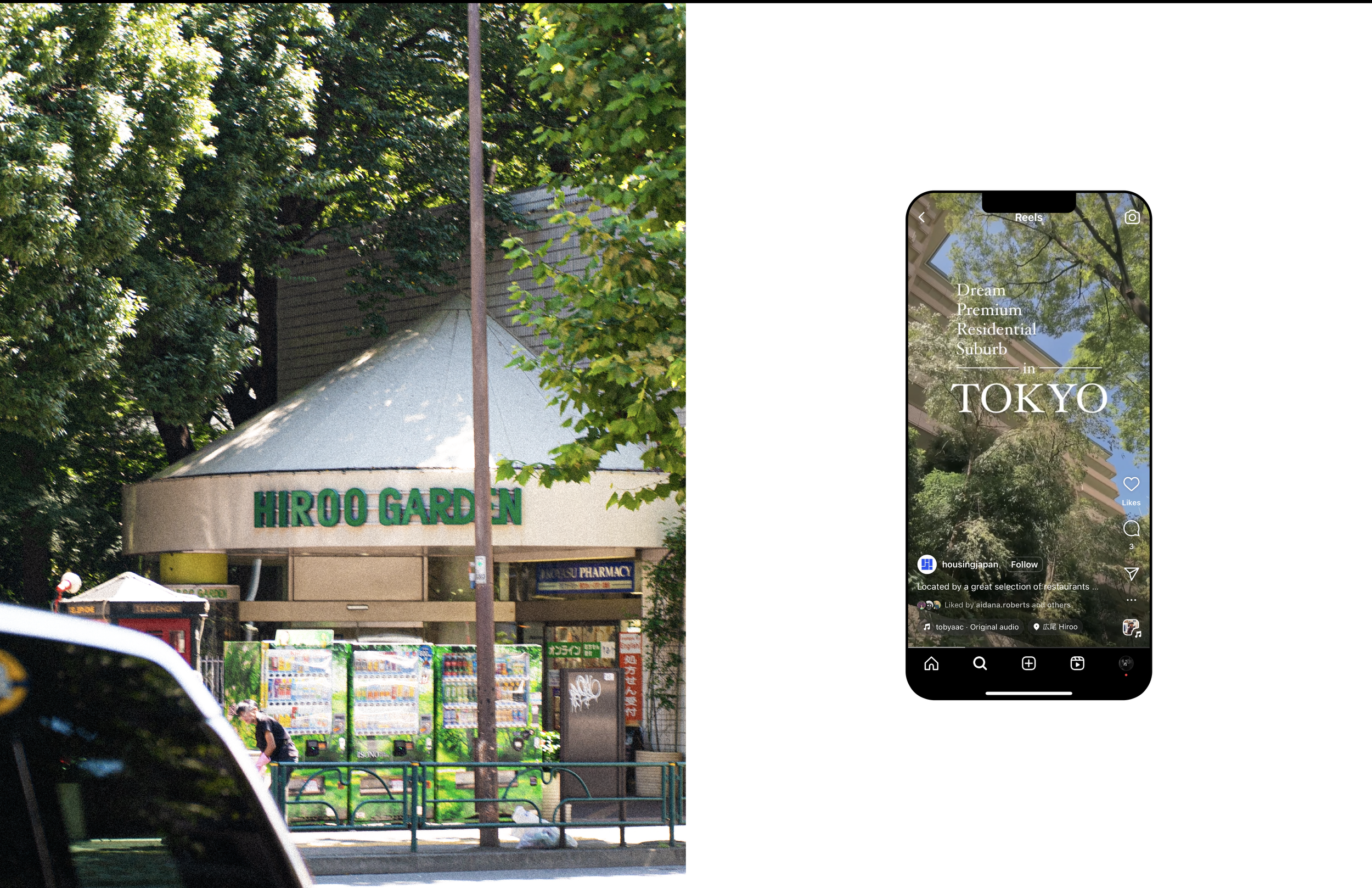
Following the rebranding, SEO strategy was implemented, which included writing blogs on area guides and Japan real estate insights. Many of these posts achieved top-five rankings on Google for relevant searches in Japan, significantly increasing organic traffic.